
Hi all!
We. Changed. Our. Logo!
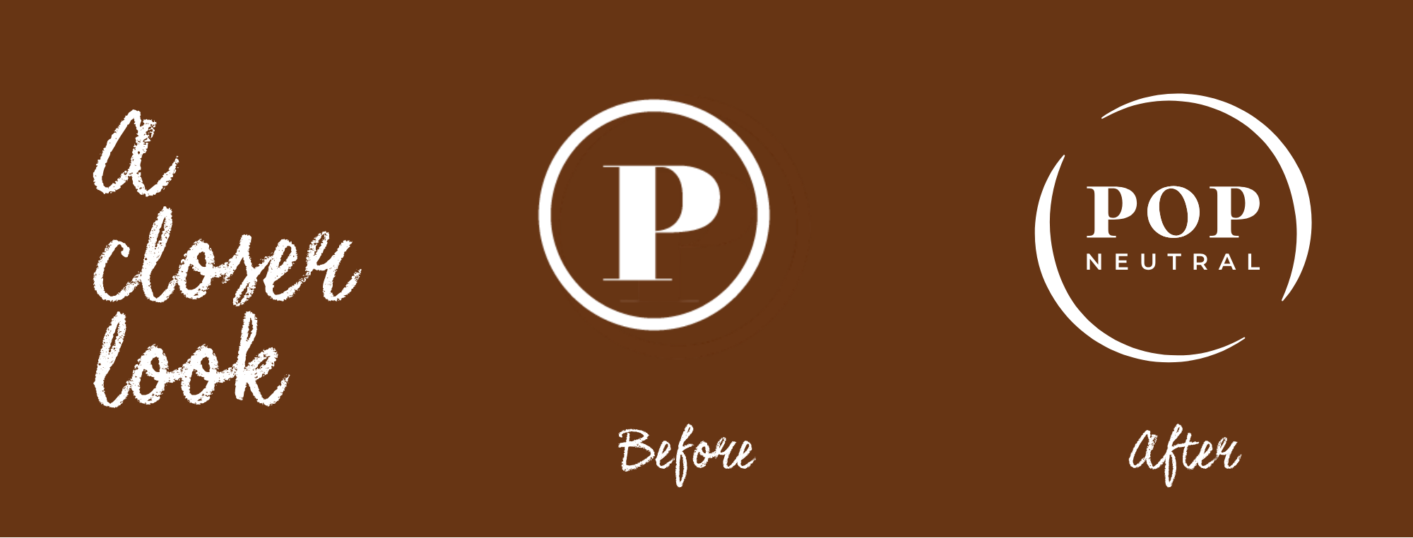
I knowww some of you will think well, “it's just a logo," right? But it's not, not to me. Every choice we've made as a brand has come from somewhere real, and this one's no different. So let me tell you the story behind it and little why.
We're calling the new icon our ‘Circular Hug’, just two curved lines, wrapping into a circle, like arms coming together. As simple as that. But the first time I saw it, something in me just went, yes, that's us!
Because if I’m honest, that’s all I’ve ever wanted this brand to feel like. Not a routine. Not a checklist of products. A hug. Something that holds you, quietly, and gives more than it asks in return.
And here's the part that means the most to me. This symbol isn't about one chapter of life. It's not just for the mums, or the pregnant bellies, or one specific "us." It's for anyone who needs a little softness in their day. Which, if you've been with me for a while, you already know is exactly where my heart has been taking this brand.
Changing a logo isn't something we did lightly, or quickly. But it felt like the right time to let the outside of POP Neutral finally catch up to what's always been true on the inside.
With Care